

imgix.js
High-performance responsive images without sacrificing creative control


Responsive images, now
easier than ever.
imgix.js is a dependency-free JavaScript library for the browser that allows you to easily use the imgix API to make images on your site responsive.
imgix.js makes using the srcset attribute and the <picture> element easier. These are widely-supported standards that allow you to deliver a great responsive experience.
Install the latest version of imgix.js with bower:
bower install --save imgix.js
Install the latest version of imgix.js with npm:
npm install --save imgix.js
imgix.js Documentation
imgix API Documentation
Download imgix.js (min)
Getting Started
If you don't already have an imgix account, it’s free to sign up. imgix.js makes use of the imgix URL API, and require images to be served through an imgix Source.
imgix.js makes heavy use of the srcset and sizes attributes available on <img> and <picture> elements. These allow modern browsers to deliver a responsive experience to their users. By generating comprehensive srcset rules, you can deliver pixel-perfect experiences to all browsers and devices.
Because imgix renders images on the fly, you don’t need to worry about manually generating a new image for each size. For a primer on how srcset and sizes work, read “Srcset and sizes” by Eric Portis.

Using imgix.js with srcset for resolution switching
When people think responsive images, they usually think “resolution switching.” Resolution switching is serving a different resolution image to different devices. The content, crop, and composition of the image remains the same, but the resolution changes.
imgix is a service uniquely equipped to handle this case. All renders are generated on the fly and cached at edge locations around the globe. With imgix.js, implementing resolution switching is simple:
<img ix-src= "https://assets.imgix.net/examples/moon.jpgw=400&h=300&fit=crop&crop=entropy"
sizes="(min-width: 768px) 540px, 100vw"
alt="A photo of the moon">
sizes="(min-width: 768px) 540px, 100vw"
alt="A photo of the moon">
Upon initialization, imgix.js will augment any image element with the ix-src attribute to generate an exhaustive srcset definition. Here’s what you will see under the hood if you inspect the element:
<img ix-src= "https://assets.imgix.net/examples/moon.jpg?w=400&h=300&fit=crop&crop=entropy"
sizes="(min-width: 768px) 540px, 100vw"
srcset="
https://assets.imgix.net/examples/moon.jpg?w=100&h=75&fit=crop&crop=entropy 100w,
https://assets.imgix.net/examples/moon.jpg?w=210&h=158&fit=crop&crop=entropy 210w,
...
https://assets.imgix.net/examples/moon.jpg?w=2618&h=1964&fit=crop&crop=entropy 2618w.
"
src= "https://assets.imgix.net/examples/moon.jpgw=400&h=300&fit=crop&crop=entropy"
alt="A photo of the moon">
ix-initialized="ix-initialized">
The resulting image will be loaded in at 540 logical pixels wide on tablets and desktops, thanks to the (min-width: 768px) 540px rule. It will be loaded at 100% viewport width (100vw) on mobile screens. Modern browsers will select an appropriate image from the local cache if available. If no appropriate image is available, it will request a new image at the targeted w that it needs.
Browsers running on devices with high-density displays will select the image most appropriate for their resolution. In this example, an iPhone 6S will select the 750w URL from the srcset attribute. This is because the iPhone 6S is 375 logical pixels wide, but has a screen density of 2x. Thus, 375 × 2 = 750.
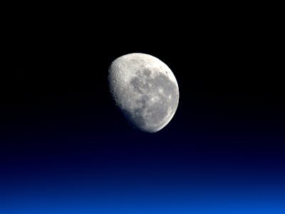
The result is that just the right image is loaded for each device and browser. imgix.js is able to easily handle resolution switching by generating srcset attributes.
Simplifying Configuration
imgix.js provides the ability to greatly simplify how you define your images and their operations on your site. This is done with the ix-path and ix-params attributes on <img> elements.
<img
ix-path="/examples/moon.jpg"
ix-params='{
"w": 400,
"h": 300,
"fit": "crop",
"crop": "entropy"
}'
ix-host="assets.imgix.net"
sizes="(min-width: 768px) 540px, 100vw"
alt="A photo of the moon"
>
ix-path="/examples/moon.jpg"
ix-params='{
"w": 400,
"h": 300,
"fit": "crop",
"crop": "entropy"
}'
ix-host="assets.imgix.net"
sizes="(min-width: 768px) 540px, 100vw"
alt="A photo of the moon"
>
This code results in the same image as the above example, but is easier to read and understand. The definition of ix-host can also be defined globally in a <meta> element, so that all images on the site use the same host. Please see the imgix.js documentation for more on how that works.
Using imgix.js with <picture> for art direction
imgix.js can also be used for art direction in responsive images by using the <picture> element. Art direction in responsive images allows you to have more creative control over the images at different breakpoints, such as being able to specify different crops at different breakpoints.
imgix.js is able to exhaustively generate srcset attributes on <source> elements contained within a <picture> element.
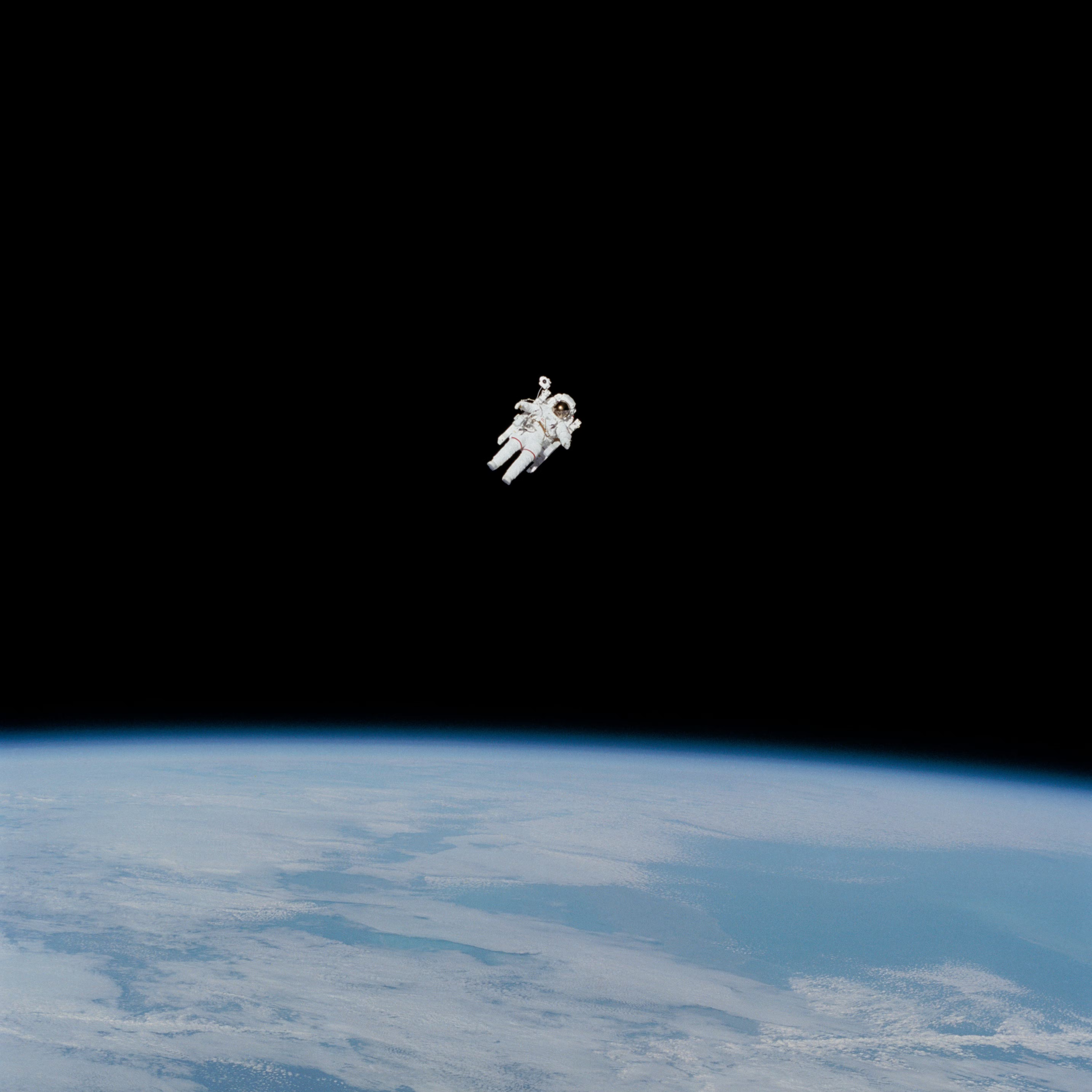
For this example, we will specify 2 different sources: one wide (16:9) crop for the desktop and one square (1:1) crop for mobile devices.
<picture>
<!-- Wide crop -->
<source
media="(min-width: 768px)"
sizes="640px"
ix-path="/examples/astronaut.jpg"
ix-params='{
"w": 1600,
"h": 900,
"fit": "crop",
"crop": "middle"
}'
>
<!-- Square crop -->
<source
sizes="calc(100vw - 48px)"
ix-path="/examples/astronaut.jpg"
ix-params='{
"w": 300,
"h": 300,
"fp-x": 0.49,
"fp-y": 0.4,
"fp-z": 3,
"crop": "focalpoint",
"fit": "crop"
}'
>
<img ix-path="/examples/astronaut.jpg" alt="Astronaut in space">
</picture>
This code allows for different crops at different viewport sizes. At viewports wider than 768px, our image receives a crop at a 16×9 aspect ratio. Smaller than 768px, we give the image a square crop to show just the astronaut.
Try resizing the browser window to see this effect in action. Because the contents of the 2 images are different, the browser will request a new image to download the crop it doesn’t have.
As with our previous examples, the exhaustively generated srcset attributes allow each browser to select the exact size needed for proper display. This is all done without binding event listeners to the window, which means the experiences will always be very smooth or "jank-free."
Implement Today
imgix.js provides a great way of implementing responsive images on your site in the most performant way possible. It gives enough information to the browser to make intelligent decisions to deliver the best possible experience.
Please keep in mind that the srcset attribute and the <picture> element are only x supported on modern browsers. If you need to support legacy browsers, pair imgix.js with Picturefill, our recommended responsive image polyfill.
Resources
More examples and documentation of implementation can be found below.
© 2011 - 2024 imgix, Inc.
